Give each number context
A large value without its unit or direction of change leaves the reader to reconstruct its meaning.
Health readings and everyday commitments compete for attention on the same screen. For HealthHub, I designed a personal overview that preserves numerical context and reorders its mobile layout around the day ahead.
Explore the screensThe dashboard combines readings with daily commitments. Four cards show health values and trends, weekly activity adds perspective, and the calendar identifies a selected date. Medication and consultations use distinct cards.
Desktop accommodates activity beside the calendar. A phone makes this composition sequential, so block order determines which question comes first. Prioritising the calendar is a design hypothesis that needs user testing.
In the source system the cabinet receives a care plan from the doctor: medication, an appointment and measurements with their frequency, next to a measurement diary, questionnaires and articles. The prototype represents this with medication and consultation cards, a calendar and a plan for the day; weekly activity is an authorial extension beyond the original.
The case is based on a real public health insurance system (2023) covering both the insured person’s cabinet and the professional contour. The HealthHub name, identity and demonstration data are changed for publication, and the screens remain a prototype. The professional contour of the same system is shown in the LensCare case.
One personal dashboard in desktop and mobile layouts, using static demonstration values; the desktop layout is an authorial extension of the mobile cabinet.
A large value without its unit or direction of change leaves the reader to reconstruct its meaning.
Simply stacking the desktop layout would place the calendar after activity and delay access to the selected day’s context.
Medication and a consultation call for different interpretations; identical event cards would obscure that distinction.
A large value without its unit or direction of change leaves the reader to reconstruct its meaning.
Simply stacking the desktop layout would place the calendar after activity and delay access to the selected day’s context.
Medication and a consultation call for different interpretations; identical event cards would obscure that distinction.
Each of the four health cards combines a value, unit and trend. The weekly activity chart includes an average line as a visible reference for individual days.
A trend or average cannot explain why a reading changed. The overview does not provide grounds for a medical conclusion.

Desktop places activity beside the calendar below the metrics. Mobile uses a 2 × 2 metric grid, moves the calendar before activity and introduces bottom navigation.
The weekly overview sits further down the phone page. People primarily checking activity may need more scrolling, which future testing should examine.
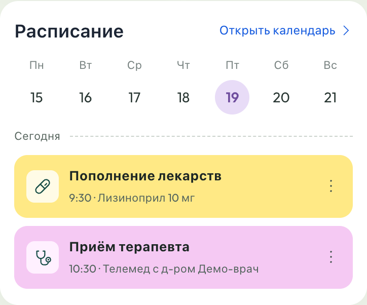
Separate card types distinguish medication from consultations; in the source care plan these are different events with different frequency. A selected state in the calendar provides a visible date reference while reviewing the page.
Selecting a date only changes its highlight in the demo. Updating events and handling dates without events remain implementation tasks.

Fragments of the current Russian-language prototype. The original interface for an evidence-based before/after comparison has not been added.
To add: the original screen, date and comparison conditions.
The palette, component fragments and CSS values from the current prototype. The full system specification and usage rules still need to be added.
Pink #F5C9F3, green #179A55, yellow #FFE985 and blue #416DE2 distinguish blocks. Labels carry the meaning of health information.
The family declared in CSS. Missing fonts or glyphs use the system fallback.
To add: text roles and the complete type scale.
Selected spacing and corner-radius values from CSS. These examples are not an approved token scale.
Four indicators sit above the weekly chart and calendar, placing activity beside daily commitments.
Units and trends remain within cards; the calendar precedes activity above bottom navigation.
Read-only HTML previews of the original Russian-language prototypes. Demo data; personal identifiers replaced.
Name, value, unit and trend retain their roles across layouts, preserving the elements needed to interpret each number.
One personal dashboard in desktop and mobile layouts, using static demonstration values; the desktop layout is an authorial extension of the mobile cabinet.
Prototype interface
Adaptation through priority. The same blocks take different arrangements. Mobile prioritises the calendar while retaining the weekly perspective further down. The diagram describes the case logic. Working transitions are limited by the current prototype.
The challenge, decisions and prototype are documented. The process history, contributors and intermediate versions still need supporting material.
Visual identity and user interface design.
One personal dashboard in desktop and mobile layouts, using static demonstration values; the desktop layout is an authorial extension of the mobile cabinet.
Scope documented
Decisions and trade-offs documented
Layouts available above
User testing remains a next step
The responsive dashboard includes four indicators, weekly activity with an average, a calendar and differentiated event cards. Its mobile layout implements a different order for the calendar and activity blocks.
Artefact inventory
Artefact inventory
Artefact inventory
The numbers describe the prototype’s scope. User impact has not been measured.
To add: baseline, test method, sample and results.
Values are static, date selection does not update events, and navigation only changes active styling. The demo does not establish completed health actions. With no baseline or user testing, effects on understanding or daily habits remain unknown.
In a future test, identify a reading’s value, unit and trend direction.
Record unit errors, misread trends and cases where the average is mistaken for a personal normal range.
Find medication and a consultation on mobile, then locate the weekly overview.
Observe search order, scrolling, backtracking and errors distinguishing event types.
After connecting event data, select a date and explain which commitments belong to it.
Check date-to-card correspondence and understanding of an empty day without moderator prompts.
The current rental comes first